Hey — Marcelo here 👋
Looks like you were redirected to my previous portfolio.
No worries — you're in the right place. I'm currently building a new version of the site (which is probably where you came from).
In the meantime, feel free to explore this version below — you should still find what you're looking for.
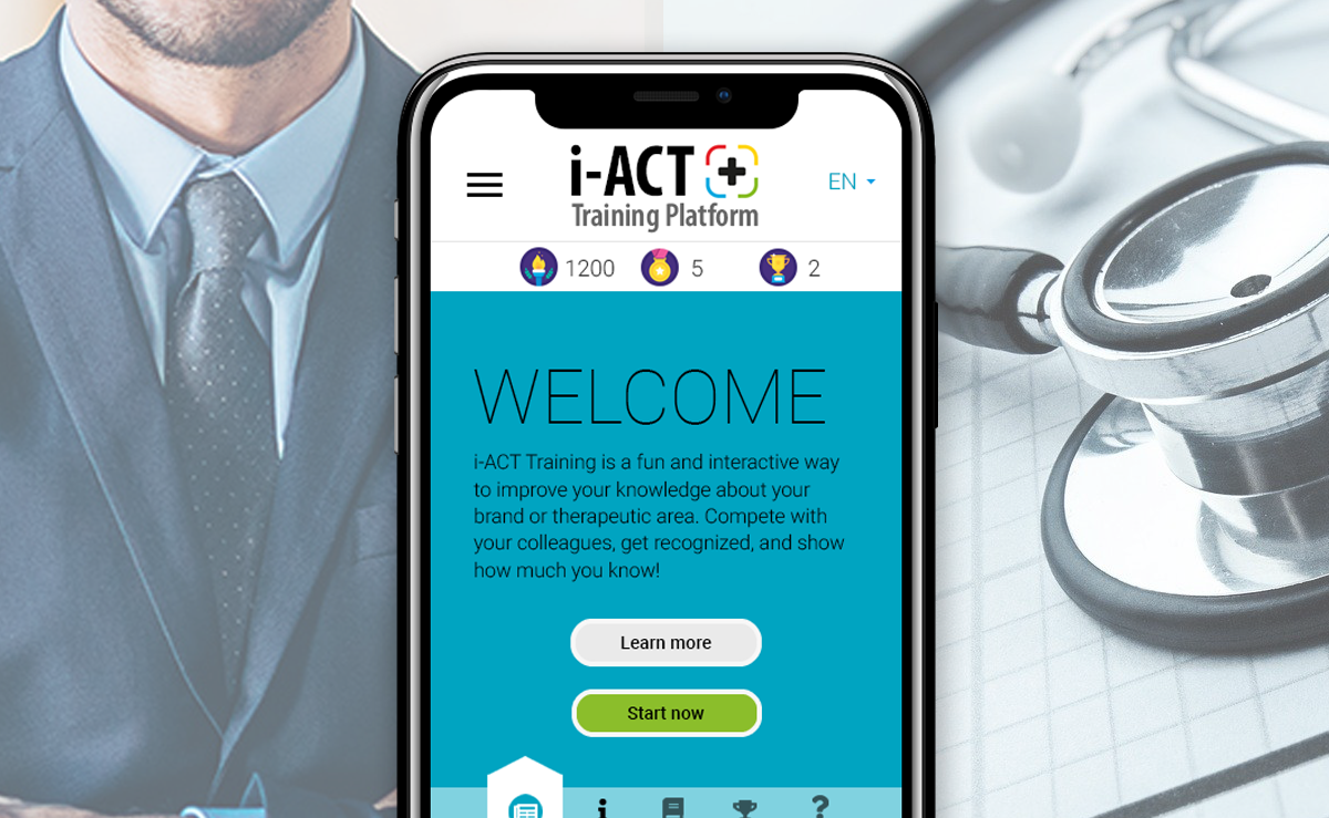
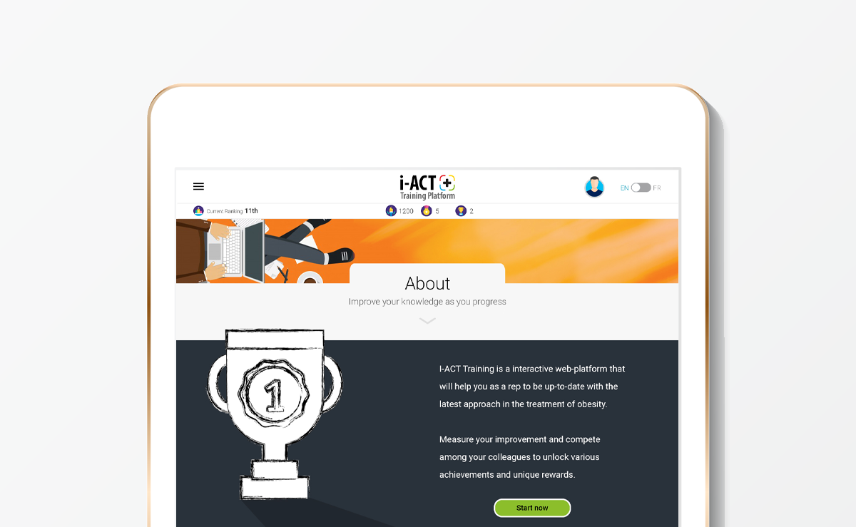
An innovative Continuing Medical Education (CME) experience empowering sales reps to speak with physicians at the forefront of obesity care.
The team and I went bold and pushed boundaries to exceeded both users and business expectations and bring the client home.
Complex systems rarely fail because of design. They fail because no one reframed the problem.
The initial request was straightforward: create a single platform where physicians could access the latest approaches in obesity treatment.
But the context told a bigger story. Obesity rates in Canada had risen 15% between 2022 and 2024, reaching 68% of adults aged 18–79. This wasn’t just an information problem — it was an ecosystem problem.
Very early on, I identified two expansion opportunities and one critical challenge.
Opportunity 1: Go beyond physicians and educate the general public.
Opportunity 2: Build a sense of community instead of just a content repository.
Challenge: Prevent a knowledge gap between physicians and sales representatives that could negatively impact commercial performance.
When I presented these considerations, the client was aligned strategically but concerned about cost and timeline. That reaction validated the approach — we weren’t just executing a brief; we were thinking it through and pushing it to success.
My proposal was bold but intentional: build two platforms, not one.
Different audiences. Different motivations. Different behaviors.
But two platforms alone would not solve adoption. A beautifully designed portal that no one uses is like a couture dress that never reaches the ballroom.
Mapping the sales rep persona revealed the real friction: limited time, performance pressure, and low tolerance for “non-sales” activities. The solution was clear — make learning engaging, competitive, and measurable.
Gamification wasn’t a creative flourish. It was a strategic lever.
When challenged on the “what” and the “why,” I could confidently provide and explain the answers, anchored in both user and business goals.
This is how applied UX begins — not with features, but with the courage to zoom out and fully understand, even reframe the problem.
More times than not we had to deal with budget and timeline restrictions. We must be agile.
After winning the pitch, I was given the opportunity to lead the multidisciplinary cell responsible for delivering the project — designers, researchers, developers, QA, and communications — while continuing to serve as visual and UX lead.
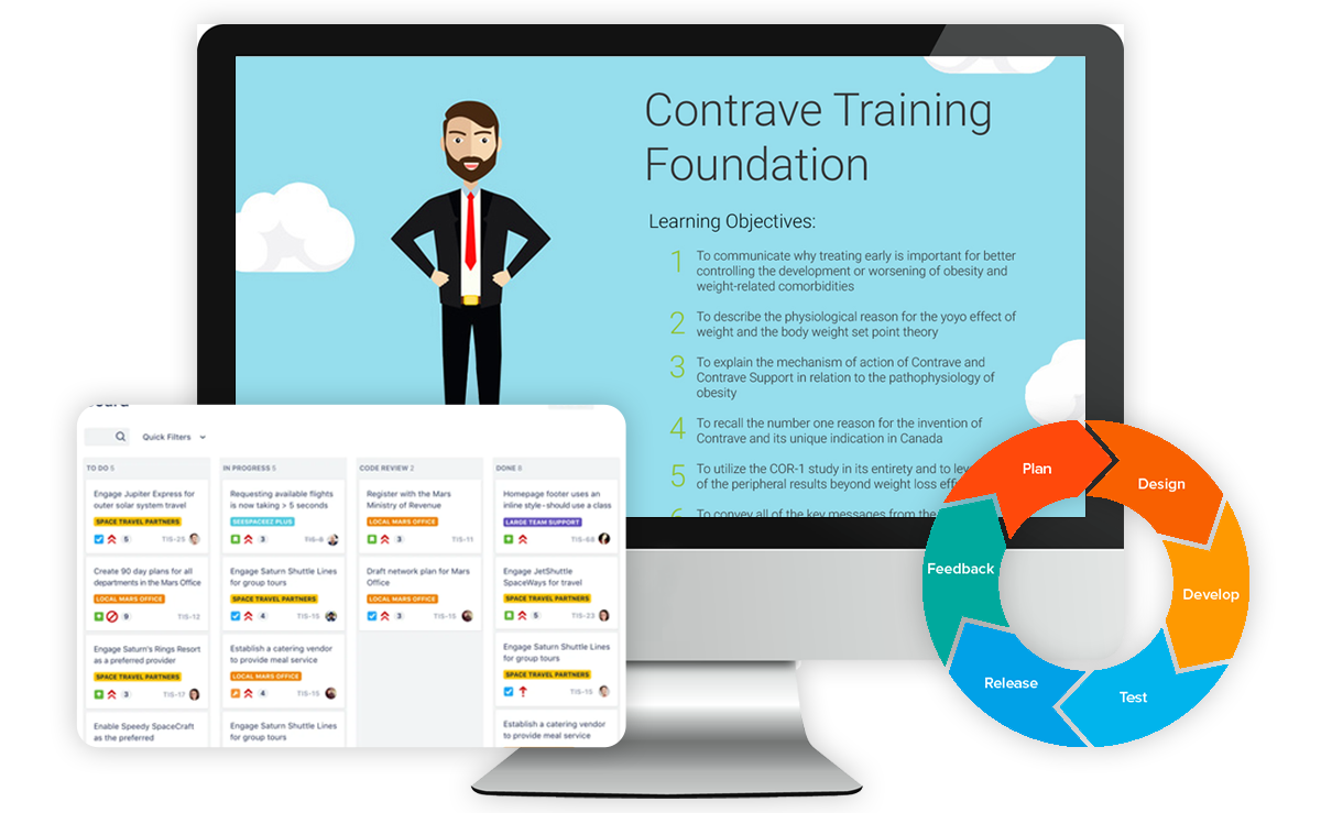
Before a single screen was designed, I documented the foundation: functional specifications, success criteria, and a modular roadmap. The strategy was simple — deliver value early, learn, improve. This allowed the team to meet initial deadlines and budget expectations while creating room to expand based on real user feedback.
Agility, in this case, wasn’t about speed only.
With structure in place and stakeholders aligned, we built a system designed to evolve without breaking — including expectations.
Good branding is not decoration. It is a system of decisions working together.
From the beginning, I advocated for a branding system that could balance two worlds: learning and engagement.
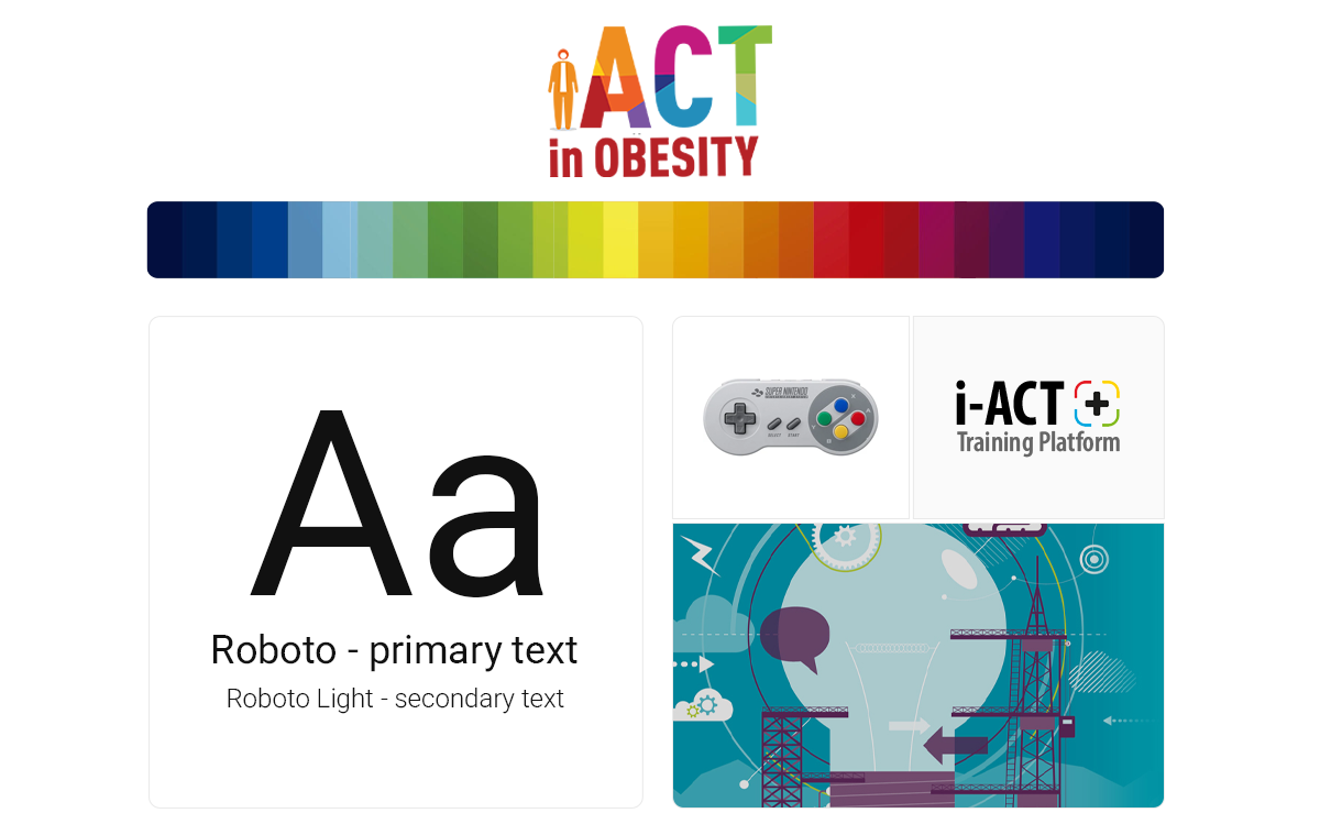
I decided to prioritize typography that favored readability and compatibility over expressiveness. Before anything else, i-act is a learning platform, and clarity had to come first. The more playful, game-like energy would instead come from the color system.
Together with the team, we picked a vibrant and versatile palette designed to immediately distance the experience from the typical “corporate learning platform” feel. The colors introduced a sense of movement and playfulness while giving the system enough flexibility to support both the educational and competitive aspects of the platform.
The logo followed the same philosophy — combining a stable, professional typeface with bold colors and shapes. This balance allowed the identity to resonate with both physicians and sales representatives while subtly introducing gaming elements through the joystick-inspired symbol.
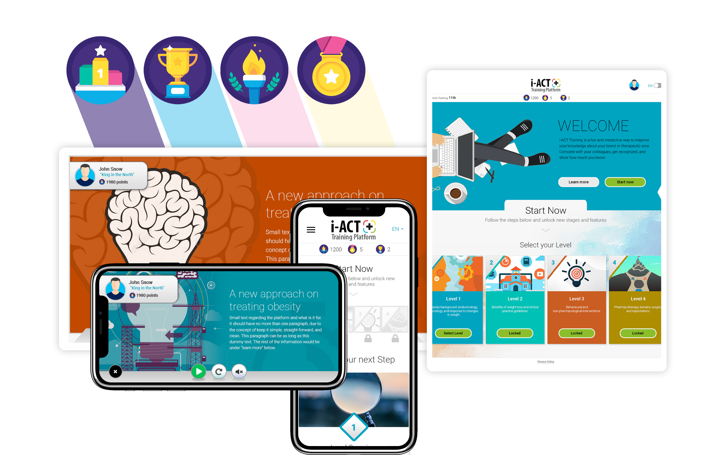
I also pushed for the use of illustration instead of realistic imagery. Beyond reinforcing the playful tone, it gave us far greater freedom to explore colors, shapes, and visual storytelling in ways that aligned naturally with the gamified experience.
Finally, I ensured the branding guide went beyond aesthetics and documented behavior. Color combinations, logo usage, and component variants were documented with accessibility and WCAG recommendations in mind, ensuring the system remained both expressive and responsible across platforms and devices.
Every element — from typography to color, from iconography to interaction — was chosen with intention: balancing accessibility, hierarchy, visual impact, and flexibility.
UX is not just screens; it's thinking, structure, and leadership.
From the start, I made sure UX principles guided the project end-to-end. Every decision — structural, visual, or functional — had to serve both the user and the business goals behind the platform.
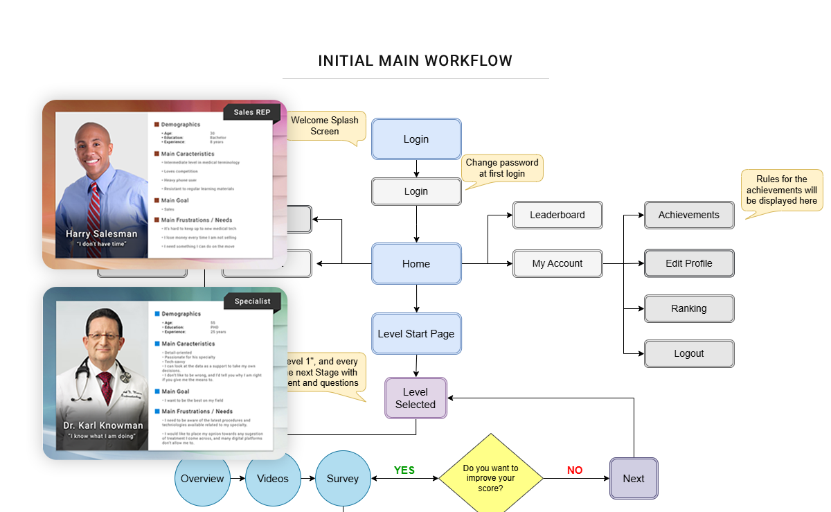
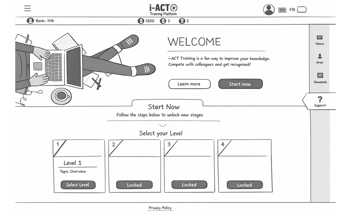
Our process followed a user-centered design approach supported by research, data collection, and continuous feedback. Together with the team, we defined the platform’s information architecture, mapped detailed user journeys, created sitemaps, and designed the complete workflow of the system — carefully identifying and refining every interaction, entry point, and exit. Usability tests and team collaboration sessions helped us validate assumptions and continuously improve the experience.
In complex projects like this, it is surprisingly easy for teams to lose sight of what they are building — and why. I made it a priority to keep the big picture visible at all times, ensuring that every decision stayed aligned with the original purpose of the platform and the value it was meant to deliver.
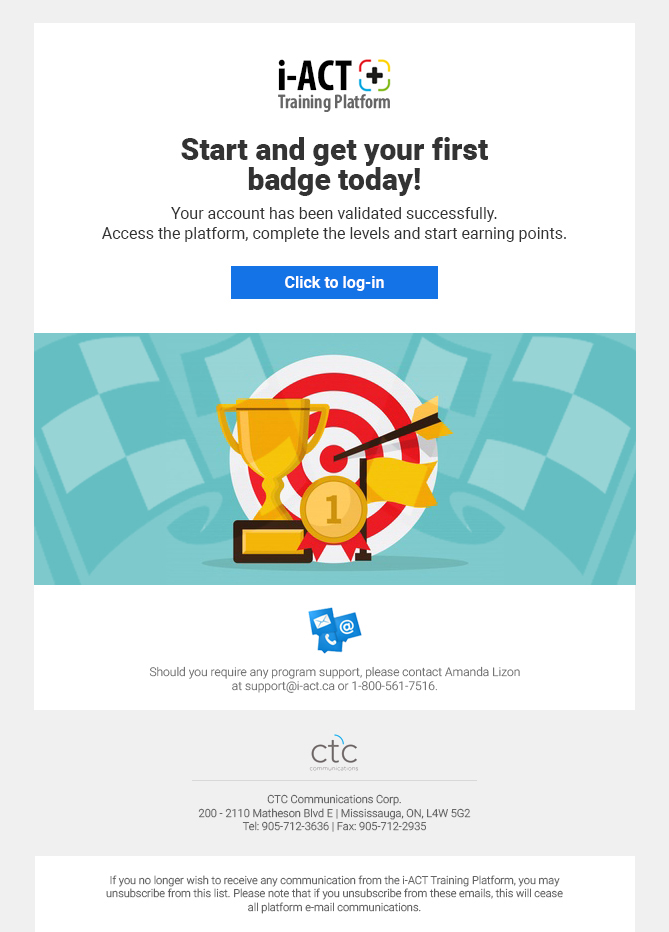
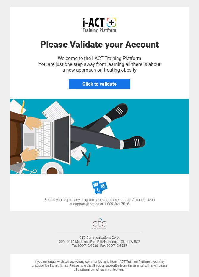
Communication design also became a key part of the experience. We defined tone, messaging, and timing with the same care applied to the interface itself. The goal was to drive adoption and course completion without sacrificing the playful spirit that made the platform engaging.
One strategy that emerged from our persona mapping was to lean into the competitive nature of our users. Instead of traditional instructional messages like “Complete this step by day X,” the system would encourage progress through game dynamics: leaderboards, rankings, and subtle prompts like “You can still catch up with the leaders,” or “One more module could move you up three positions.”
By aligning user motivation with business objectives, the experience remained both effective and genuinely enjoyable — which ultimately drove engagement far beyond initial expectations.
By the time we reached the interface design phase, much of the heavy thinking had already been done. The UX foundations, system architecture, and branding decisions created a clear framework that allowed the UI to evolve with both flexibility and purpose.
Designing interfaces for gamified environments is notoriously complex. Game interfaces demand constant feedback, clear hierarchy, and immediate user understanding — all while maintaining energy and visual engagement. Fortunately, the groundwork we had established provided both the versatility needed to explore ideas and the boundaries required to maintain coherence.
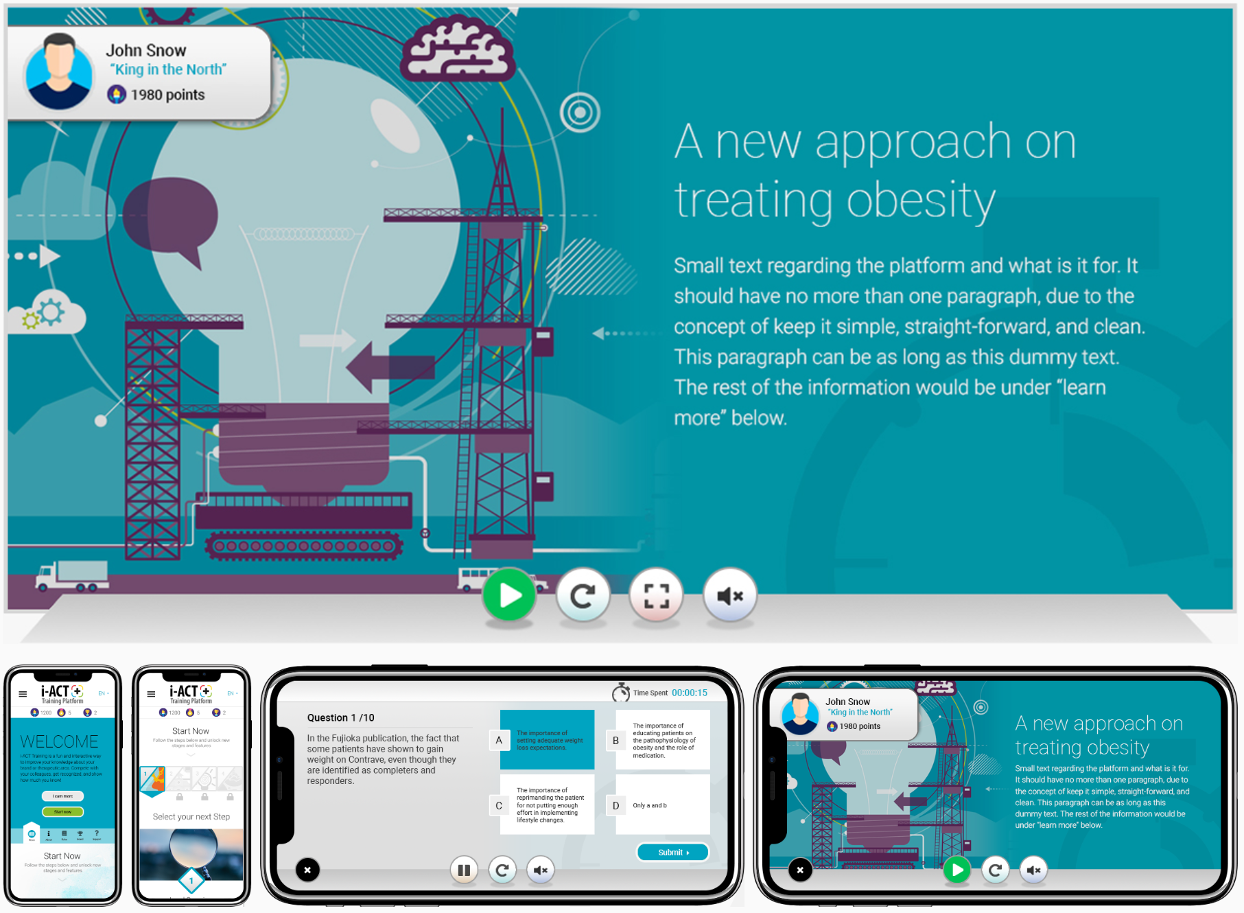
Another important challenge was responsiveness. Our user research showed that the platform would be accessed across a wide range of devices — desktops, tablets, and mobile phones. Even established gaming studios often struggle to translate desktop game interfaces into mobile experiences. From the beginning, we designed the system to be responsive, ensuring that interaction patterns, visual hierarchy, and feedback mechanisms remained intuitive regardless of screen size.
To reduce risk, we relied on A/B testing from the earliest stages. In a platform designed to drive engagement, first impressions matter enormously. If users fail to connect with the experience early, it can be difficult to win them back. Continuous testing allowed us to refine visual hierarchy, interaction patterns, and feedback loops while minimizing the chance of costly mistakes.
This phase also required extremely close collaboration with developers. Many interface decisions depended on technical feasibility and performance considerations, so design and development evolved almost side by side. At times, I even wrote small CSS prototypes myself to demonstrate interactions and visual behaviors — not only to clarify ideas but to prove they could be implemented efficiently.
The result was an interface that translated the strategic and experiential thinking behind the project into something tangible: responsive, engaging, and aligned with the motivations of its users.
Gamified platforms demand an enormous volume of visual assets. From badges, trophies, and avatars to modals, banners, icons, buttons, and feedback states — the list grows quickly as the system evolves.
At the time, our team resources were focused on other critical parts of the project, and bringing external support would have compromised both budget and timelines. I decided to take ownership of the entire asset production pipeline and created all visual elements required for the platform myself.
Each asset was delivered production-ready: optimized, organized, and documented to integrate smoothly with development workflows and across responsive layouts. Despite the scale, the system proved flexible enough to adapt naturally to different screen sizes and interface states.
Looking back, modern AI tools would have certainly accelerated parts of the process — but the result demonstrated that a well-structured design system and careful production planning can make even large asset libraries manageable.
The response to the platform exceeded even our most optimistic expectations.
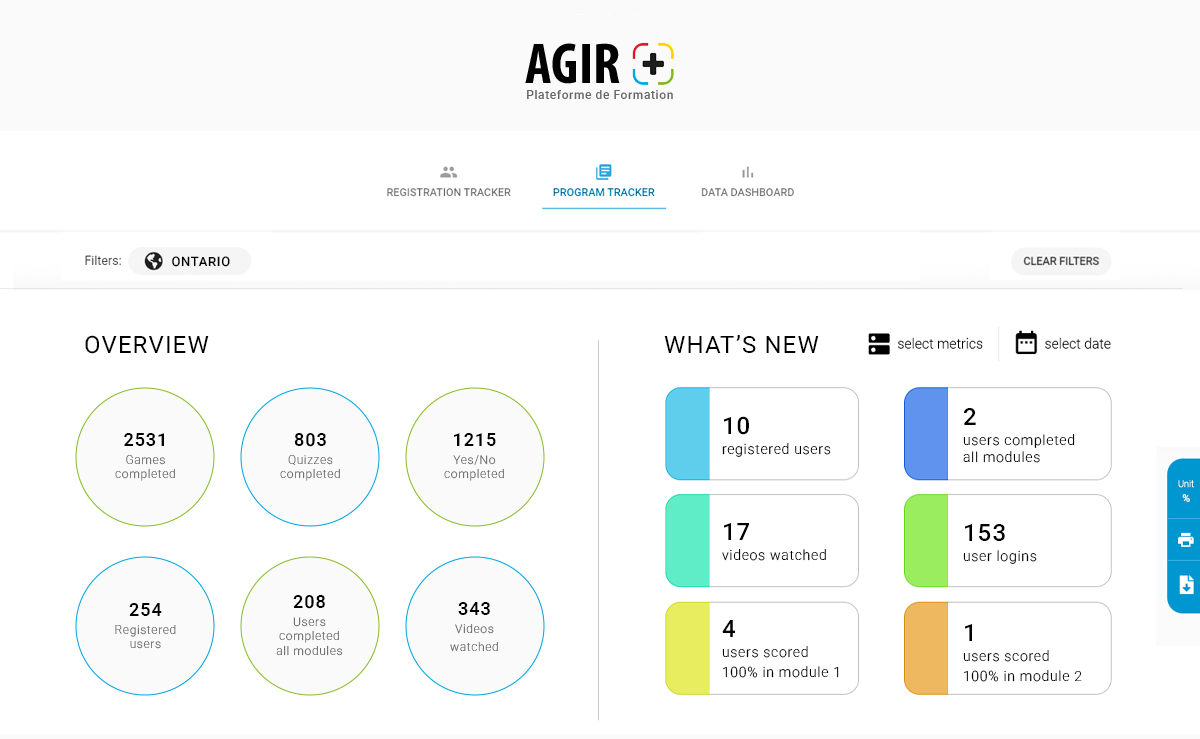
User adoption was immediate and enthusiastic. Engagement went far beyond simple course completion: users logged in multiple times a day, repeated game modes dozens — sometimes hundreds — of times to improve their scores, and actively competed for leaderboard positions.
Some achievements were intentionally designed as one-time trophies — such as being the first to complete a module or the first to achieve a perfect score during a live event. What surprised us was how seriously users took them. Our support team occasionally received calls from participants passionately arguing their case for a trophy they believed they had earned. These rewards had no financial value — only the satisfaction of owning a unique digital badge visible to their peers.
The platform even sparked offline conversations. We later learned that teams were discussing rankings and strategies during coffee breaks, turning the experience into a shared social moment within the organization.
Considering the complexity of the project and the relatively small team behind it, the outcome felt particularly rewarding. What began as an ambitious idea became proof — for ourselves, our leadership, and our client — that thoughtful design, collaboration, and a willingness to push boundaries can transform a product experience into something people genuinely want to engage with.
The success of the project strengthened the relationship with the client, who became a long-term partner afterward. More importantly, it left our team with a clear feeling: when the vision is strong and the work is done with care, it is possible to dream bigger — and deliver.