Hey — Marcelo here 👋
Looks like you were redirected to my previous portfolio.
No worries — you're in the right place. I'm currently building a new version of the site (which is probably where you came from).
In the meantime, feel free to explore this version below — you should still find what you're looking for.
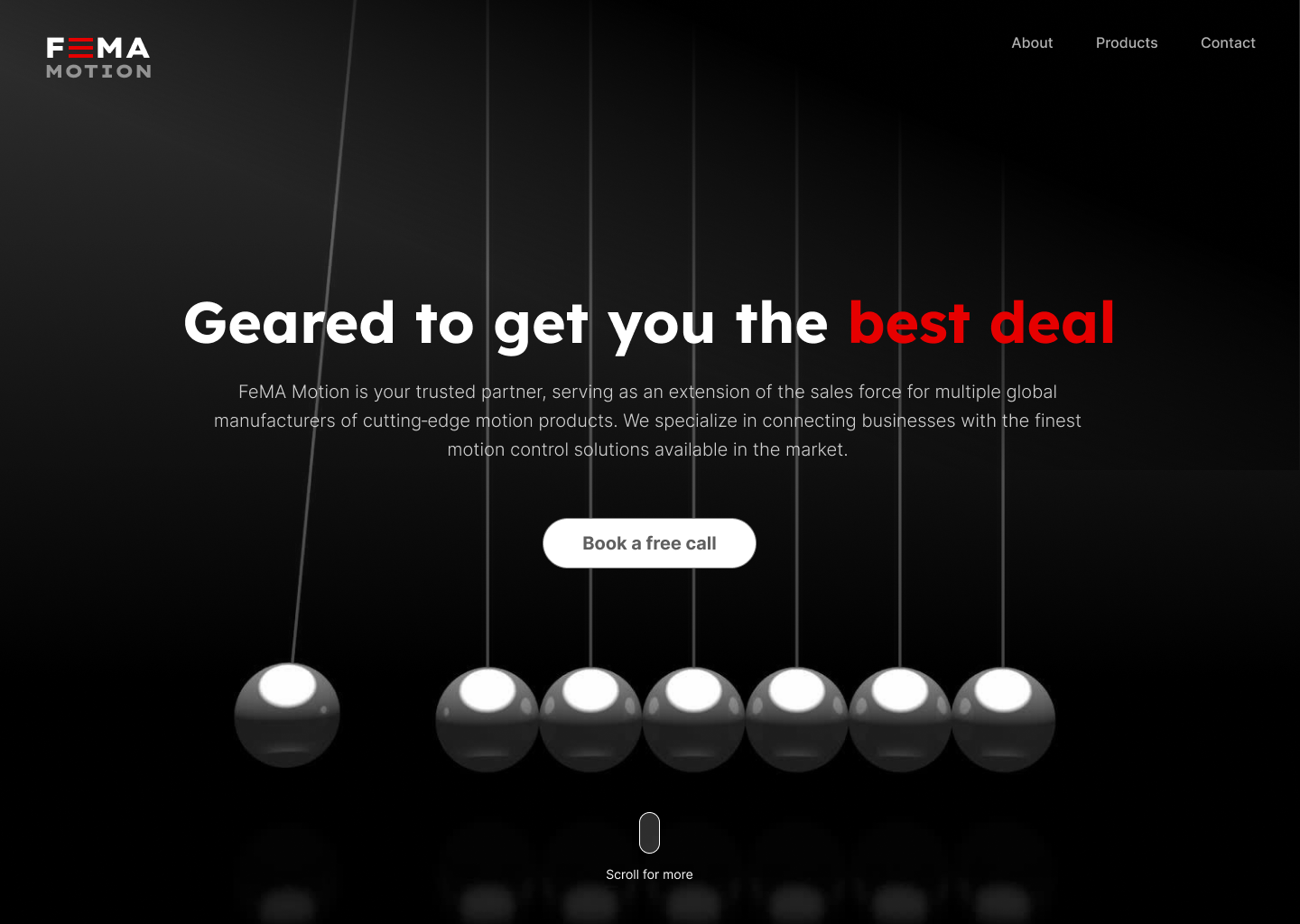
A second rebrand of FeMA Motion, focused on pushing the concept of motion further across the brand and digital experience.
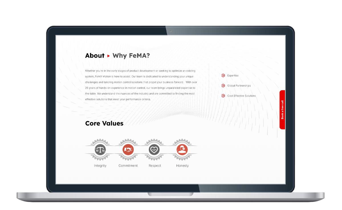
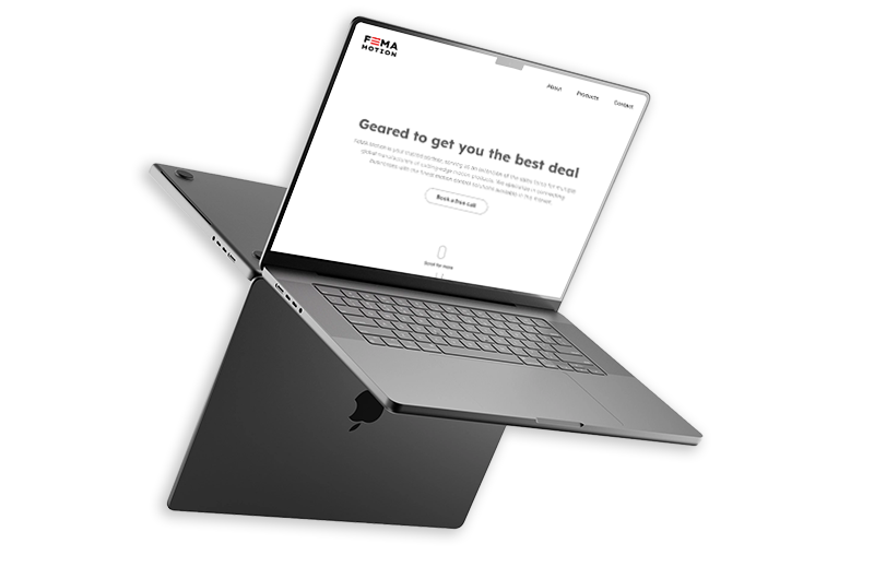
Working once again within tight budget and timelines, the project revisits the company’s identity and website—elevating its visual language and refining the user experience to create a more dynamic, expressive, and impactful presence.
The initial 2024 project laid the foundation for an ongoing collaboration built on trust and results.
What began as a complete rebrand and website redesign evolved into a long-standing partnership, as the success of the first phase demonstrated the value of a strategic, design-driven approach. As the company grew and its ambitions expanded, the need for a second transformation naturally emerged.
This new phase focuses on refining and elevating FeMA Motion’s identity and digital presence—building on what was established while pushing the brand further in clarity, expression, and impact.
As the brand evolved, it became clear that the visual identity needed to follow—shifting toward a more modern and expressive direction.
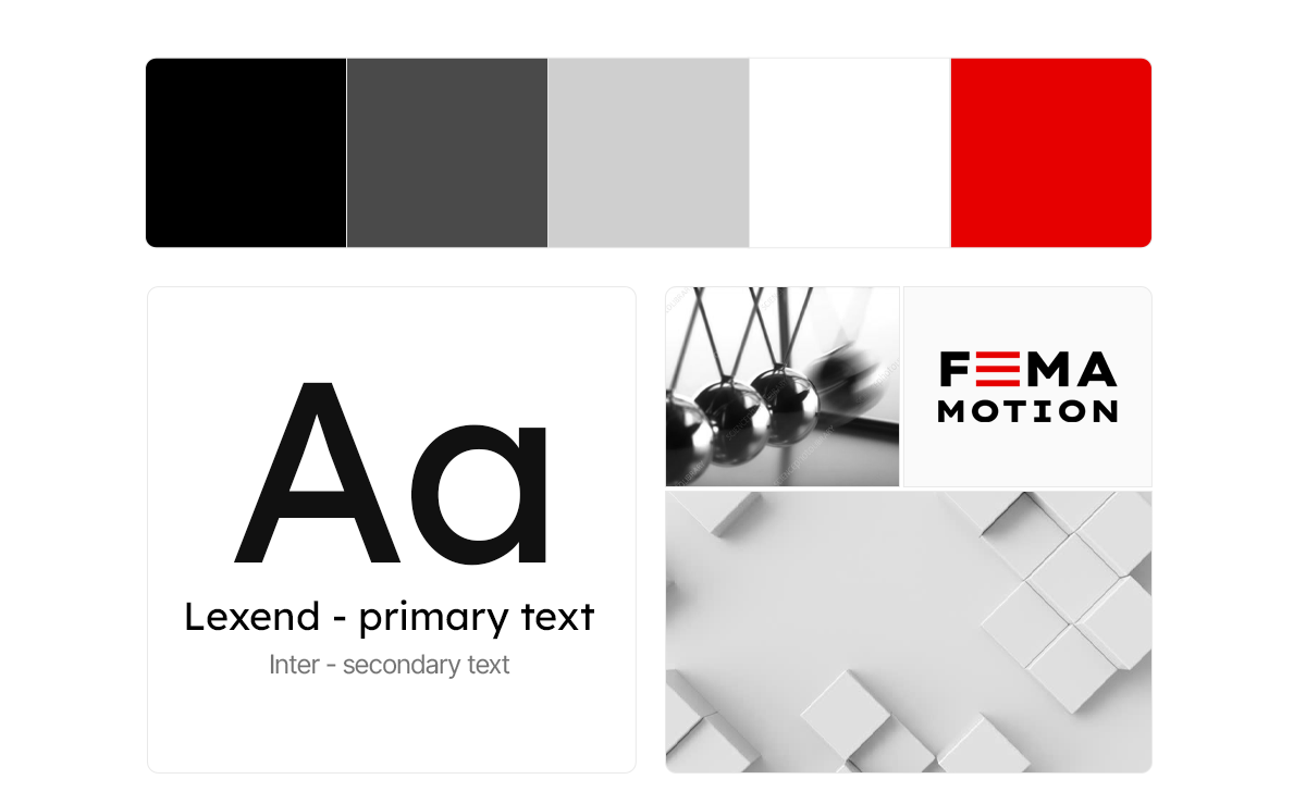
The new logo was designed with simplicity and clarity in mind, built around a strong, contemporary typeface and supported by a bold accent color. This approach not only refreshed the brand’s appearance but also introduced a visual system that feels current, flexible, and more aligned with today’s digital landscape.
Beyond aesthetics, these decisions were strategic. A cleaner typographic foundation and a more dynamic color palette provided the necessary tools to elevate the UI—enabling layouts that are both visually impactful and functionally clear, while reinforcing the concept of motion at the core of the brand.
The process began with typography.
Finding the right combination of primary and secondary fonts was essential to establish a clear and modern foundation for the brand. I explored different pairings, testing how they performed across headings, body text, and UI elements to ensure consistency, readability, and visual balance.
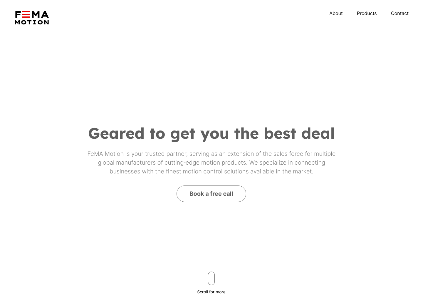
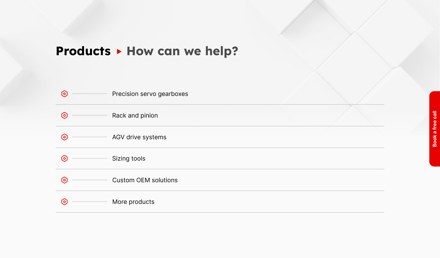
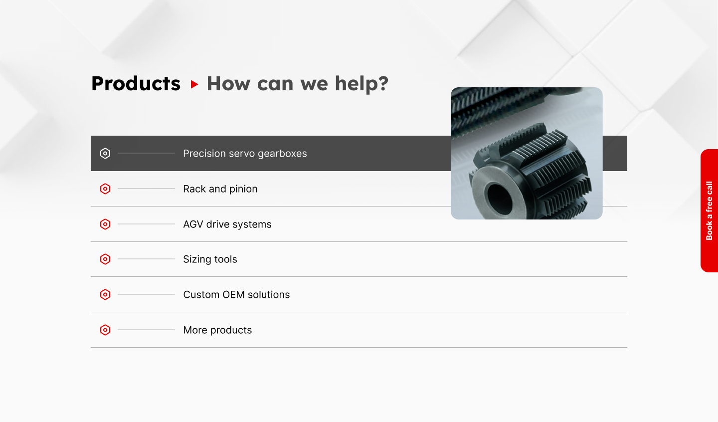
To validate these choices, I started with a minimalist approach—stripping the design down to its core elements. This allowed me to assess how typography and hierarchy behaved in real-world layouts before introducing additional layers of complexity.
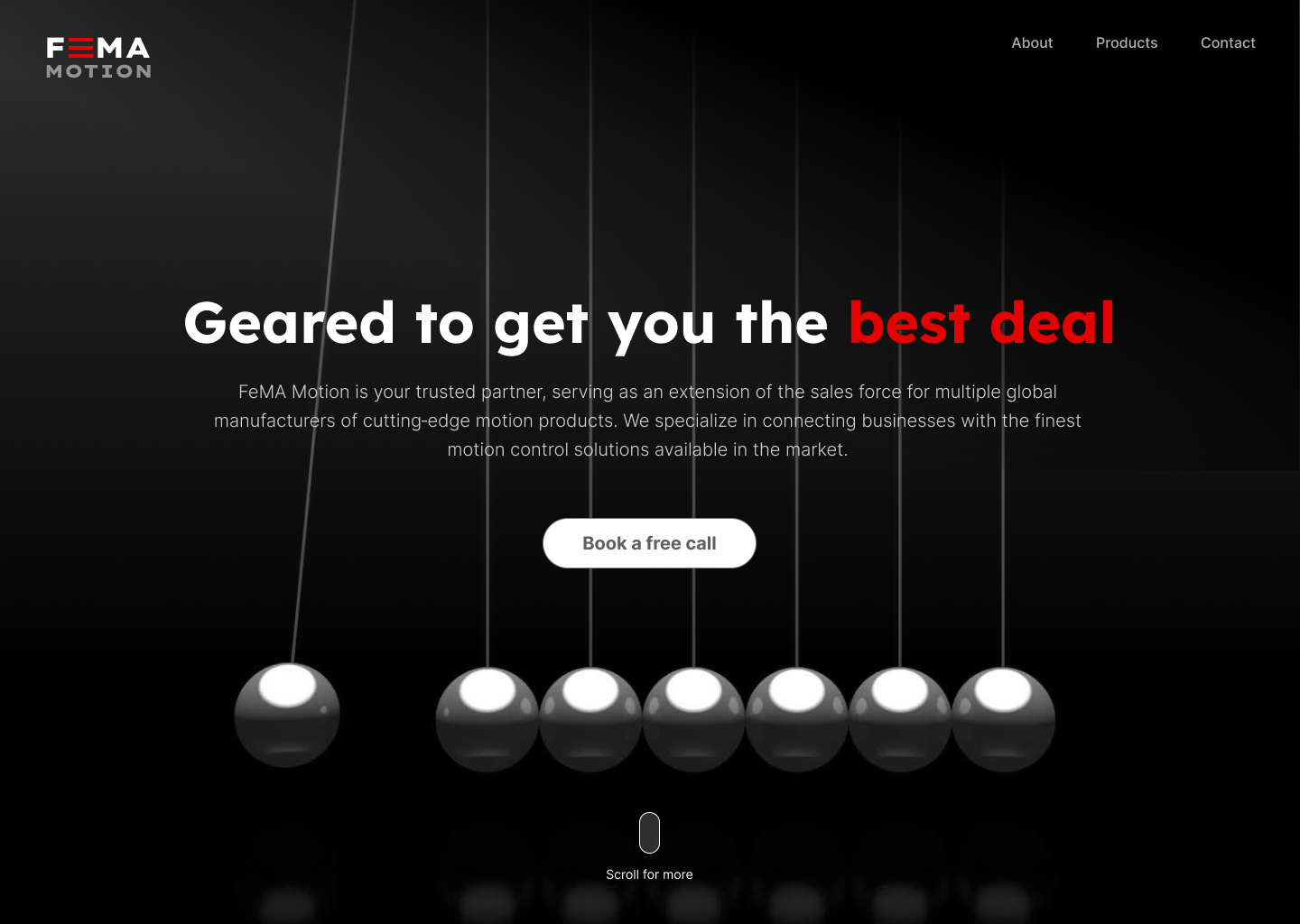
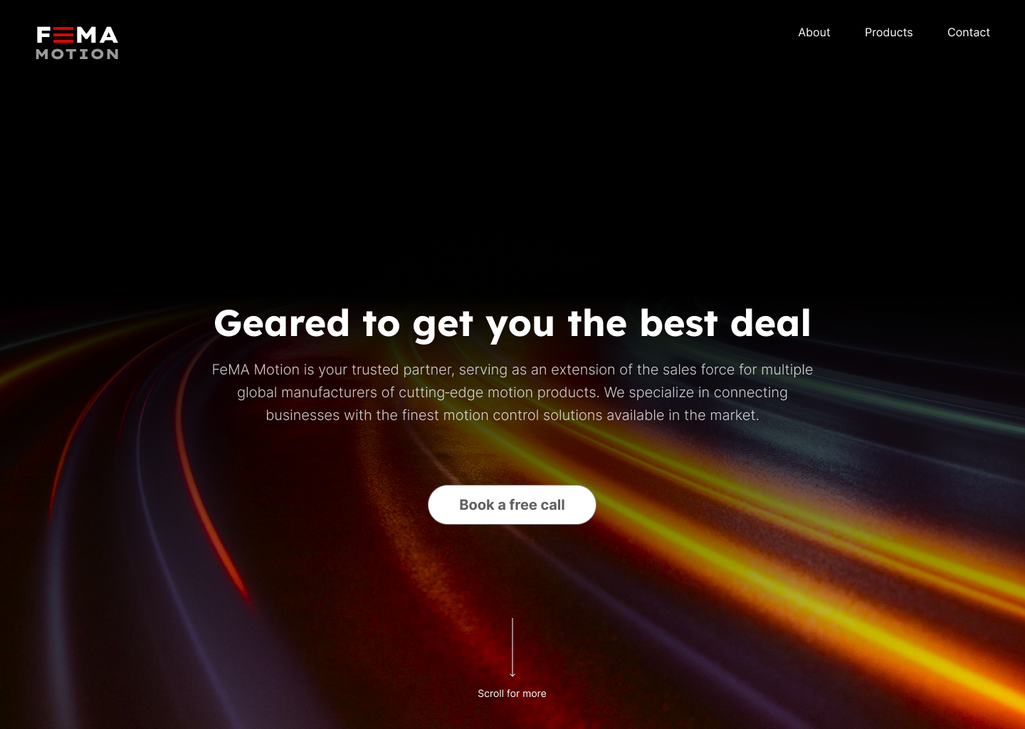
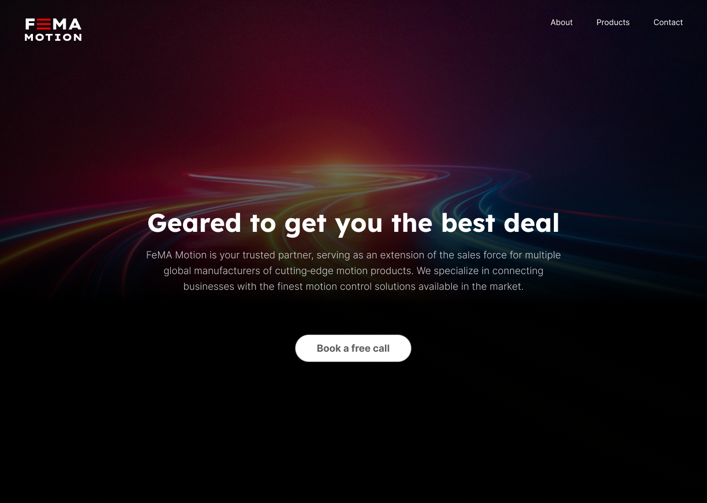
Once the typographic system and structure were defined, I moved on to visual exploration. The focus shifted to identifying imagery that could express the idea of motion—not in an obvious way, but through composition, concept, and visual tension.
The goal was to find a direction strong enough to support the brand and flexible enough to become the foundation for impactful hero visuals across the UI.
With all core elements defined—typography, hierarchy, and visual direction—the focus shifted to exploration and refinement.
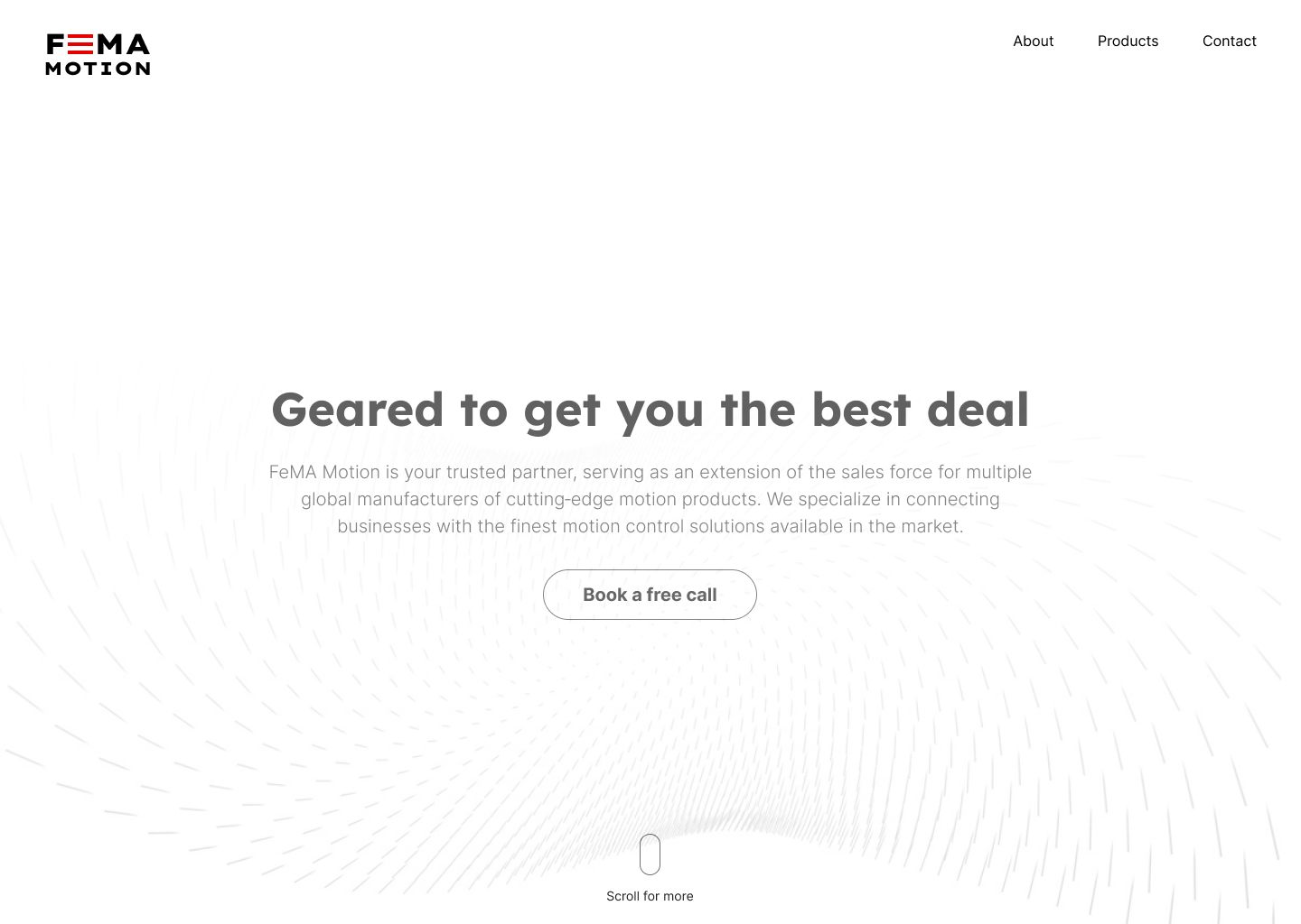
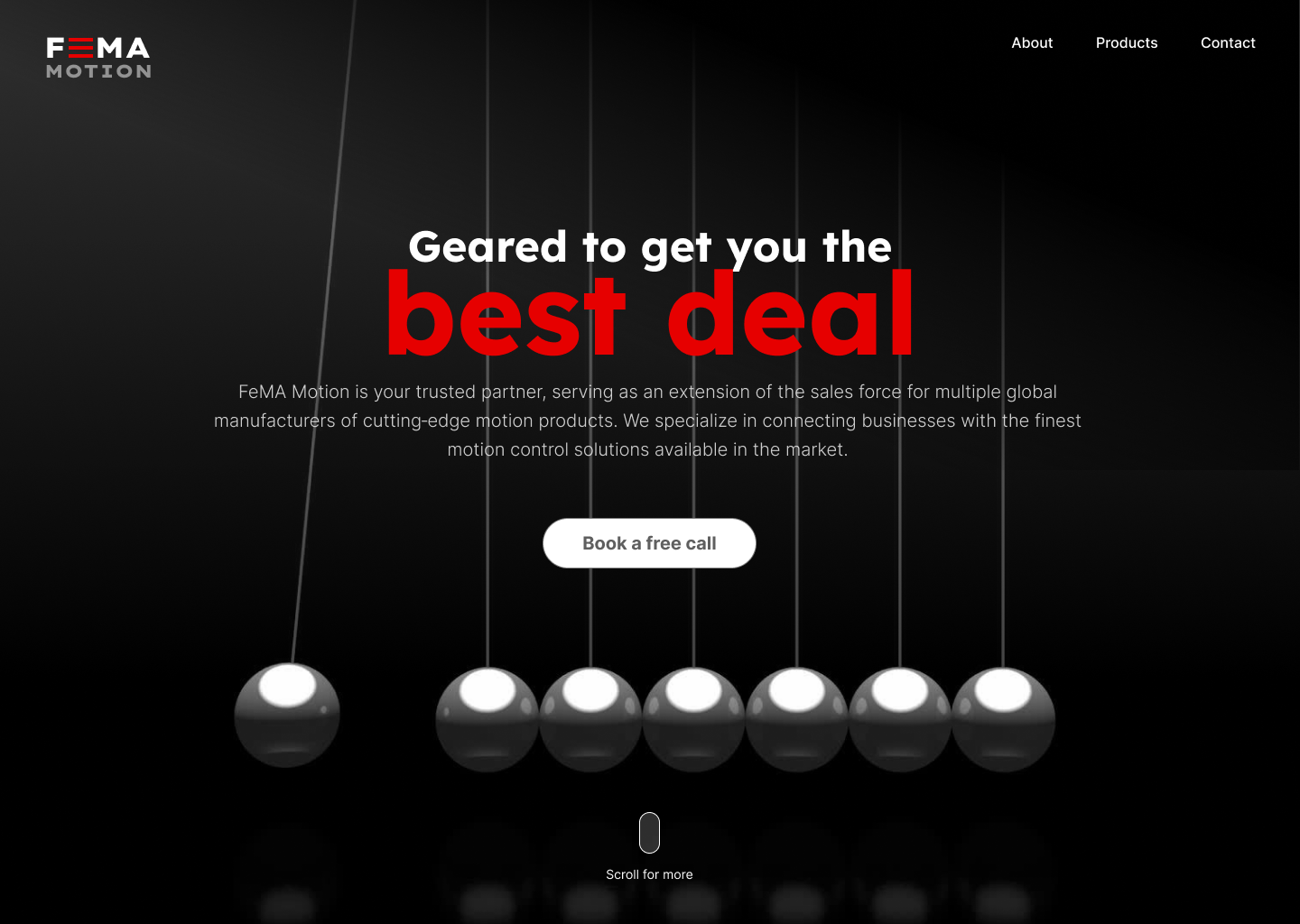
This phase was about testing combinations: layouts, compositions, and design techniques that could bring the system to life. Multiple variations were created and evaluated, allowing different approaches to emerge and be challenged until the strongest direction became clear.
The objective was to find the right balance between form and function—where visual impact supports usability, and every element contributes to a cohesive, intuitive experience.
The result is an interface that not only reflects the brand’s renewed identity, but also translates it into a clear, engaging, and purposeful digital product.