Hey — Marcelo here 👋
Looks like you were redirected to my previous portfolio.
No worries — you're in the right place. I'm currently building a new version of the site (which is probably where you came from).
In the meantime, feel free to explore this version below — you should still find what you're looking for.
A complete rebrand of FeMA Motion’s identity — from logo and visual language to its digital presence.
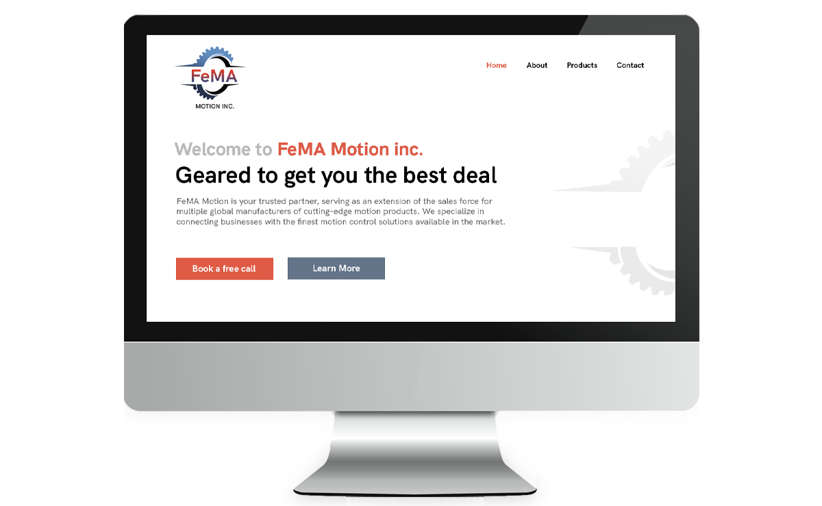
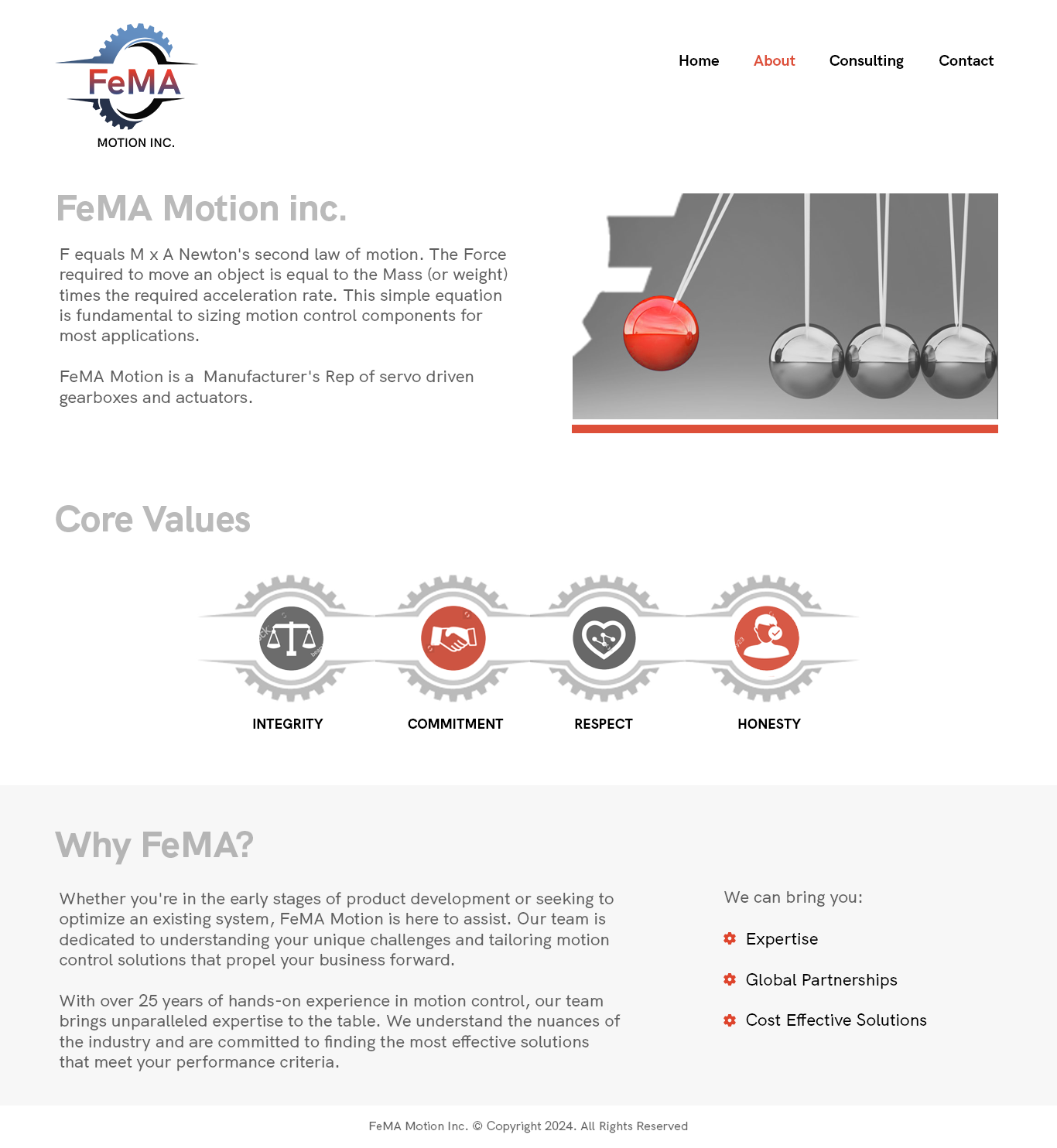
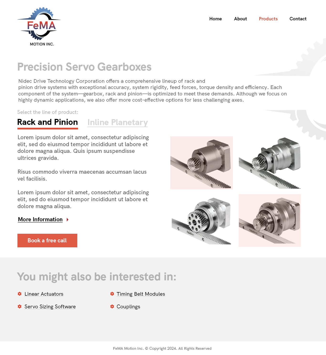
The project included a full redesign of the website, turning it into both a strong introduction to the company and a strategic sales tool, guided by modern UX and UI best practices.
Unlike many of the large pharmaceutical and financial clients I had worked with before, FeMA Motion was a small company facing a very different kind of challenge. The owner knew his business needed to evolve in order to remain competitive, but he had little familiarity with design or digital strategy.
My role quickly expanded beyond design execution. I needed to translate his ideas and expectations into a clear and practical brief that could guide the creation of a completely new brand identity. Within a tight timeline, we rebuilt the brand from the ground up and developed a new website that, together with a business card, would serve as the company’s primary introduction and sales tools.
Another important challenge was the audience itself. Many of the company’s clients came from a highly technical and traditional industry where digital experiences were not always the norm. The website therefore needed to remain extremely clear, accessible, and straightforward while still projecting professionalism and credibility.
Finally, the visual material available was far from ideal. Most of the imagery consisted of monochromatic engineering parts, often photographed in poor quality. Transforming these raw assets into something visually engaging became an additional design challenge that required careful composition, hierarchy, and branding to elevate the overall perception of the company.
A brand is more than a logo. It’s the first promise a company makes to its audience.
FeMA Motion operates in a world governed by the fundamental principles of physics, particularly Newton’s second law: F = M × A. This equation lies at the heart of motion control, describing how the force required to move an object is directly related to its mass and acceleration. A simple equation, yet one that carries the entire logic of motion.
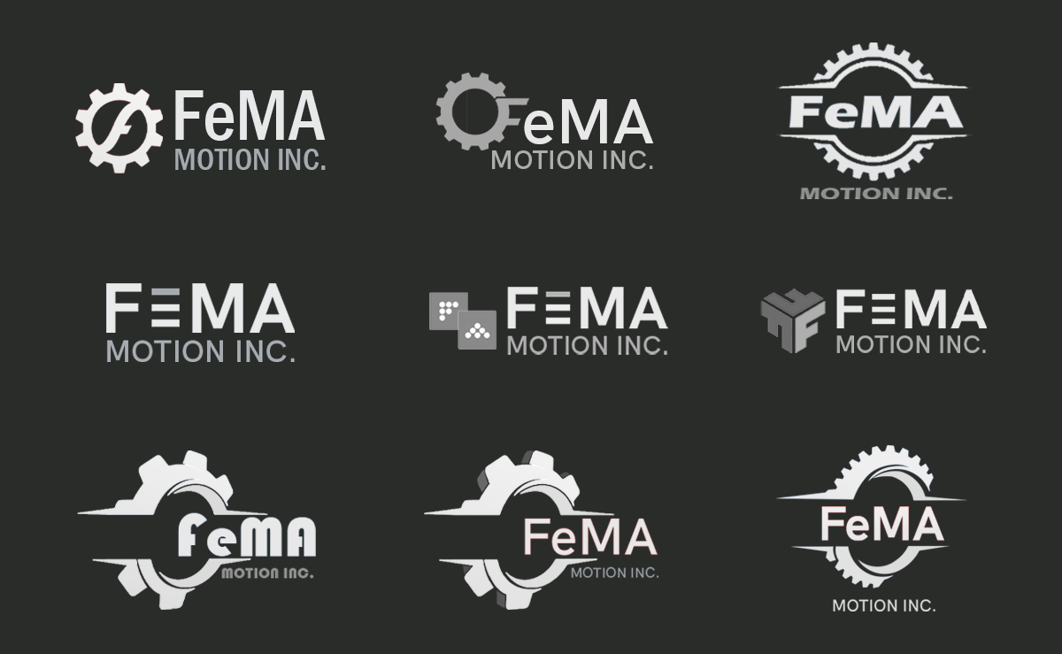
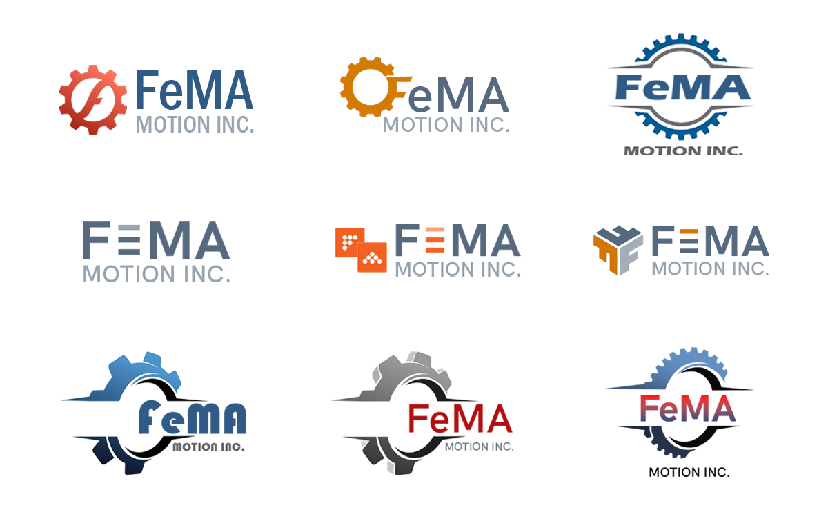
That principle became the foundation of the brand. I explored how the relationship between force, mass, and acceleration could be reflected visually, connecting the company’s name with ideas of movement, energy, and precision. Through multiple logo studies and iterations, I developed concepts that translated these ideas into a clear and recognizable visual identity.
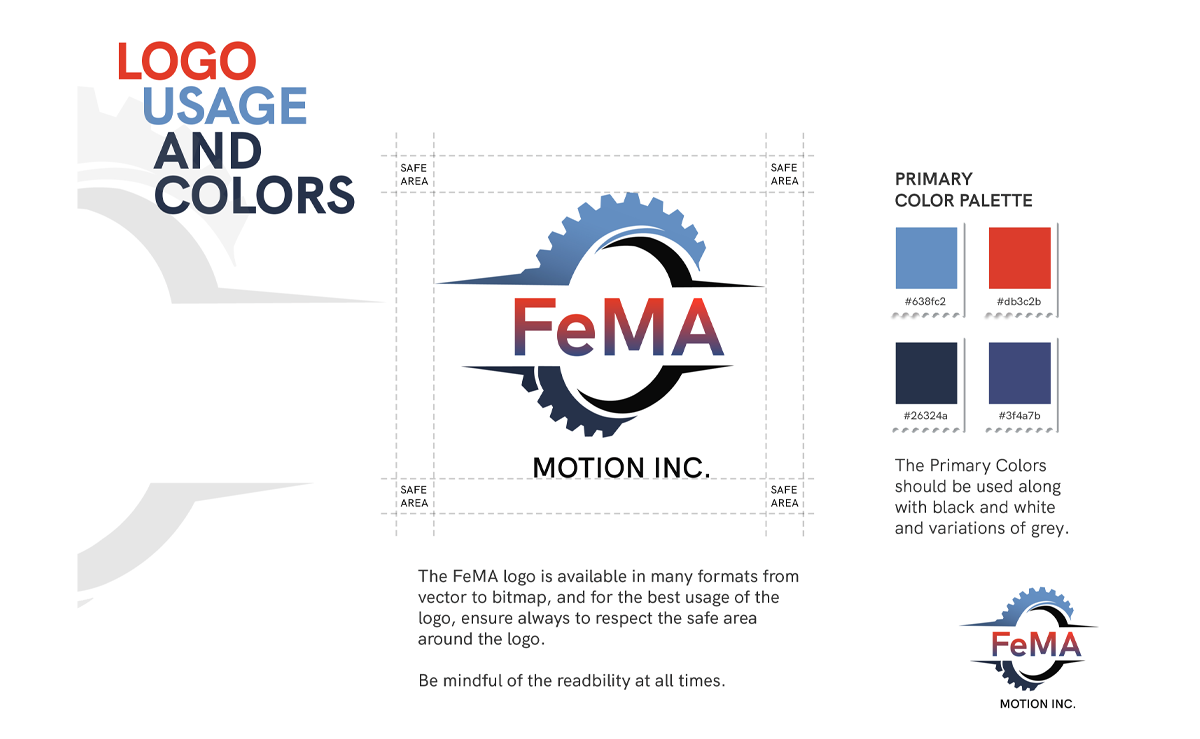
To help the client visualize the potential of the new identity, I applied early logo drafts to real-world materials such as business cards and digital layouts. Once the final direction was selected, I developed a comprehensive brand guide including the logo system, variations and applications, color palette, typography, and clear guidelines for correct and incorrect usage to ensure consistency as the company grew.
The result was more than a refreshed logo — it was a visual system capable of expressing the company’s technical expertise while presenting it in a clear, modern, and confident way.
A brand built on the very principle that defines motion: force applied with purpose.
The UX strategy began with understanding who would actually interact with the website. Through conversations with the client, we identified the primary persona: a technically knowledgeable professional, often encountered during industry events or brief business introductions.
This insight shaped several key design decisions. The website needed to communicate credibility quickly, present the company’s expertise clearly, and make it easy for potential partners to understand the value of FeMA Motion within just a few moments of interaction.
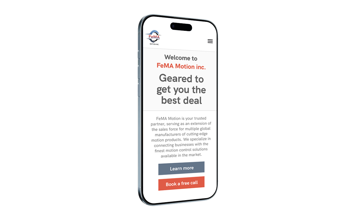
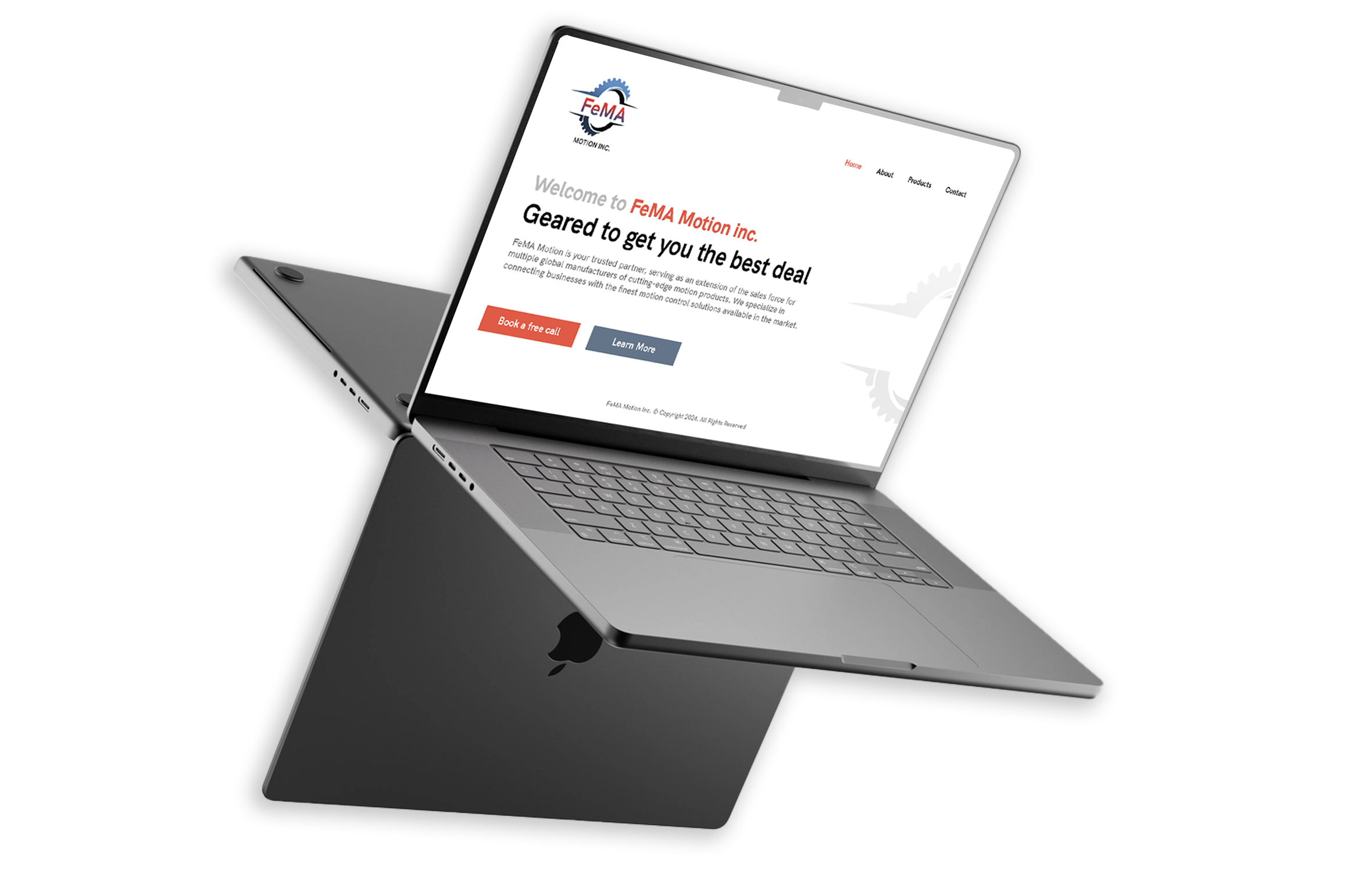
Mapping the contexts in which the site would be used revealed another important factor. While some visitors would access it from desktop computers at home or at the office, many interactions would happen on tablets or smartphones during conferences, trade shows, and networking events.
With this in mind, I chose a mobile-first approach. The goal was to ensure that the website could function as a fast and effective sales introduction — something the client could confidently show on a phone or tablet while speaking with a potential customer or partner.
Every section was therefore designed to communicate essential information quickly and clearly: who the company is, what it does, and why it can be trusted. The result was a streamlined experience that worked seamlessly across devices while supporting the client’s real-world sales conversations.
Simple. Practical. Minimal.
The interface was designed to be clean and efficient, allowing visitors to understand the company’s services quickly without unnecessary complexity. Every element served a clear purpose, ensuring the experience remained accessible to users coming from highly technical but not necessarily digital-first backgrounds.
Working closely with a communications professional, I also helped define the content structure of the website — suggesting what information should appear where and how it should be presented. Together we crafted the copy, balancing technical credibility with clarity and readability.
As part of this structure, I introduced strategic elements such as calls-to-action, anchor navigation, and contextual links. These helped transform the website from a purely informational page into a practical business tool designed to guide potential clients toward the next step: starting a conversation.
Projects like this are also a reminder of how rewarding it can be to work directly with a business owner. Being able to translate ideas and ambitions into something tangible — and helping shape the next chapter of a company’s story — is one of the most satisfying parts of design.