Hey — Marcelo here 👋
Looks like you were redirected to my previous portfolio.
No worries — you're in the right place. I'm currently building a new version of the site (which is probably where you came from).
In the meantime, feel free to explore this version below — you should still find what you're looking for.
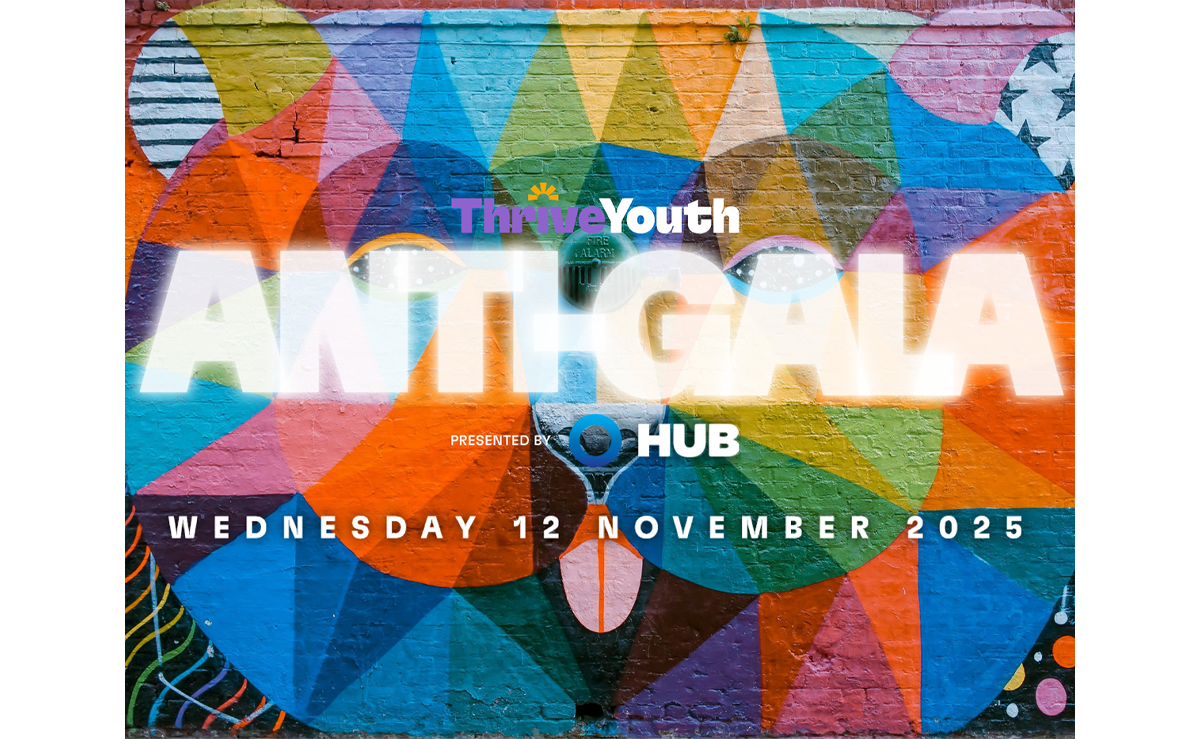
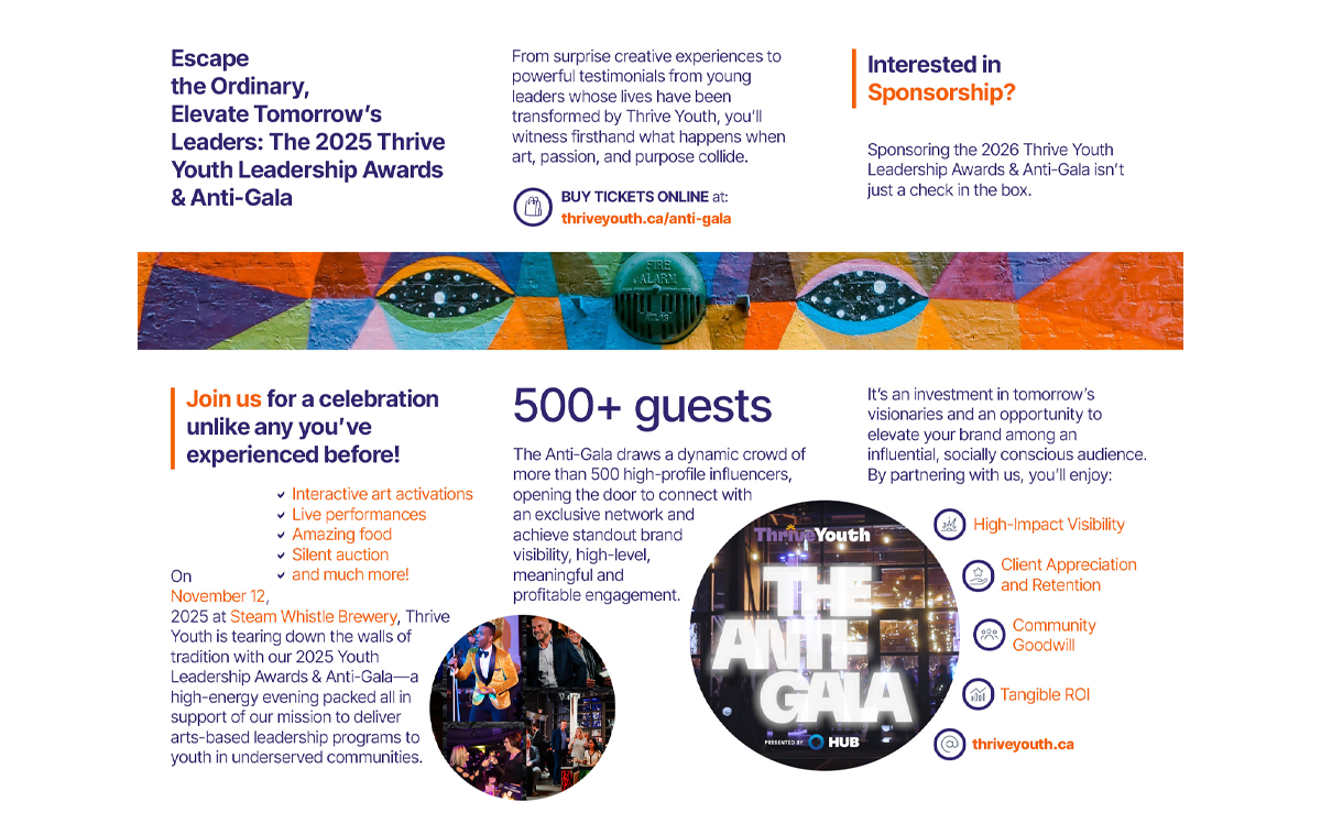
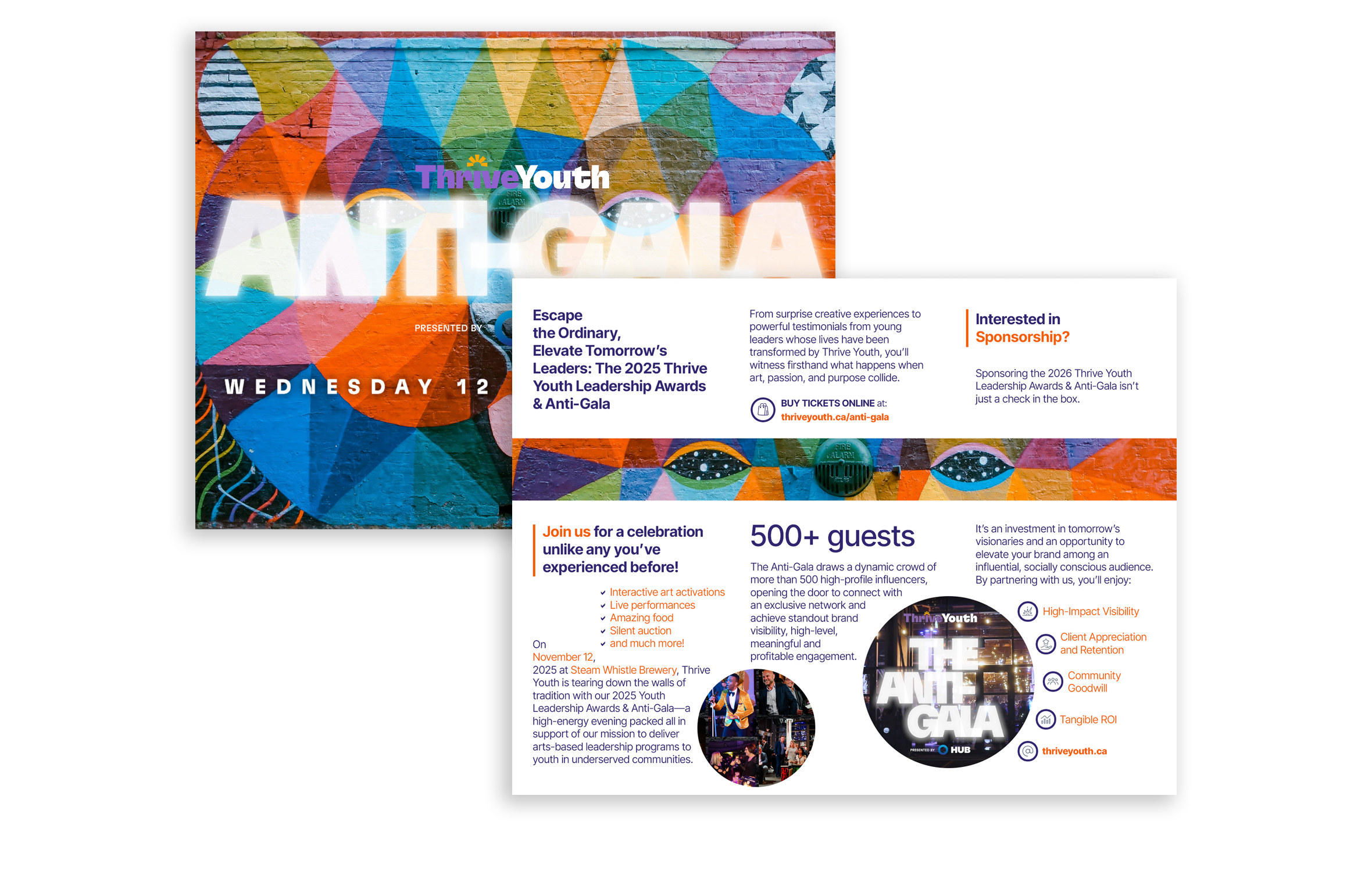
A trifold brochure designed for the ANTI-GALA charity event, created to extend and elevate the event’s visual identity across physical touchpoints.
The project focused on translating the brand into a tangible format that could engage attendees before and during the event. Through careful layout, typography, and visual storytelling, the brochure balanced clarity and impact—communicating key information while reinforcing the tone and purpose of the initiative.
Before designing the piece, it was essential to understand the nature and ambition of the ANTI-GALA event, as well as what ThriveYouth was about.
Unlike traditional charity events, this was conceived as a high-energy, immersive experience—blending interactive art, live performances, and powerful storytelling to engage attendees on an emotional level. The goal was not only to inform, but to inspire: to attract sponsors, encourage donations, and build a lasting connection with the cause.
With that in mind, the brochure needed to do more than communicate logistics, like "access the website" or "here is a how you get to the event". It had to capture the spirit of the event and act as a tool that could spark interest before the night, guide attendees during it, and reinforce the mission afterward. Understanding this landscape helped define both the format and the role of the piece as part of a broader experience.
The design approach focused on translating the event’s bold and expressive identity into a tangible format.
Every element—from layout to typography to visual composition—was crafted to create an immediate impact while staying aligned with the event’s brand. The intention was to produce something visually striking, yet clear enough to guide the reader through key information without friction.
Information hierarchy played a critical role. Content was structured to support the message without overshadowing the emotional core of the event. Because ultimately, if people don’t feel something, they won’t connect—and if they don’t connect, they won’t act.
The goal was to create a piece compelling enough to be kept beyond the event itself. Something attendees would revisit, remember, and associate with the cause—extending its impact and encouraging future support.